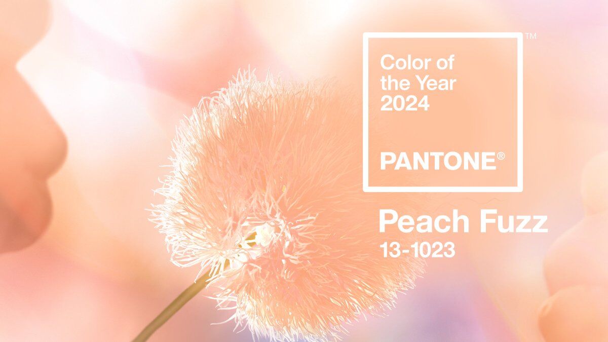
After a year of hardship — shootings, war and uncertainty regarding artificial intelligence — the Pantone Color Institute has announced that Peach Fuzz, a warm and fuzzy hue between pink and orange, is the Color of the Year for 2024.
Looking back at 2023, you can’t help but wonder if one of Pantone’s most popular colors this year — no, not Viva Magenta, the official Color of the Year, but PMS 219C (commonly referred to as Barbie Pink) — influenced Pantone’s choice, which was announced Thursday.
In an interview last week about 2024’s choice color, Laurie Pressman, vice president of Pantone, described the color authority’s choice as a much-needed balm for a country “in need of compassion” and the institute’s global wish “for a more peaceful future.”
“With that in mind,” she said, “we wanted to focus on a color that focuses on community and the ones we love. We needed it to be a color of compassion and empathy.”
The announcement is the 25th year that the prognosticators at Pantone have named a Color of the Year, a trend forecast that influences everything from paint colors to fashion (note Kate Moss and her daughter Lila’s prescient Fuzzy Peach-inspired gowns by Fendi at this year’s Met Gala), dinnerware to furniture, nail polish to lipstick, and even peach-tipped locks.
Peach Fuzz offers versatility in clothing and home goods, Pantone’s representatives said, and incorporates a tactile nature that is hard to resist. “It’s a color that you want to reach out and touch,” Exective Director Leatrice Eiseman said, as it’s “softly sensual and imminently touchable.”
At a time when people are spending more and more time on modern technology, the peach color has a vintage vibe but is also fresh and light. “It’s sensitive and sweet but at the same time quietly sophisticated, gentle and tactile,” she added.
The experts at Pantone anticipate the color will be popular for weddings and floral arrangements too. “The aesthetic is so bright and fresh and airy and sets a beautiful tone for a wedding,” Pressman said.
And don’t forget men. According to Eiseman, a color like Peach Fuzz enhances their skin tone.
Warmth, a keyword in the Color of the Year announcement, resonates with the recent emphasis on doing what makes us feel good — something that’s explored in “Queer Eye” designer Bobby Berk’s recent book, “Right at Home: How Good Design is Good for the Mind.” “The book delves into not just how to make your space pretty but how to figure out what makes you happy,” said Berk, who recently announced that Season 8 will be his last on “Queer Eye.” “What is your favorite clothing? Vacation? You should work those things into your home because they will make you happy.”
That’s because color is an emotional experience, said Eiseman, a color specialist. “Color speaks to you because it has an emotional attachment to you. People always worry: ‘Will others like it?’ Listen to your inner self. You’re the one who’ll be living with the color.”
What if your inner self is color-challenged? That’s where Pantone comes in.
“It’s all about what suits you,” Eiseman said, explaining her role as a color psychologist of sorts. “We do trends, but it’s from the standpoint of how we create an idea that brings comfort to you. We try to help you overcome the negative aspects of color.”
Looking at upcoming trends, she said, “It’s always a challenge to open people’s ideas to other colors. We create the palettes just like we do for the forecast. Colors are rarely used in isolation. And that’s a challenge.”
As with previous years, there will be critics who won’t buy into peach interiors, clothes, mountain bikes and accessories, no matter how well the peach vibe pairs with the other colors in the Pantone color chart or how warm and comforting it was intended.
If a color speaks to you, the challenge is making it work. “We try to open your imagination and give you a skill set,” Eiseman said. Color should never be about dogma and judgment, especially for less confident people.
According to the color experts at Pantone, choosing a color is less about design and more about making yourself happy. Added Pressman: “It’s about reframing how we want to live.”
Lisa Boone writes for the Los Angeles Times.